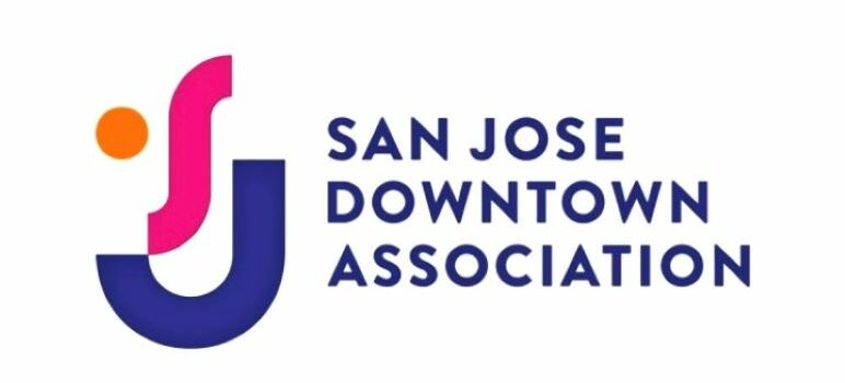
The San Jose Downtown Association unveiled a new logo this morning developed by local branding firm Liquid Agency featuring a three-color modernist geometric design incorporating the letters “S” and “J” and suggesting a one-eyed smiley.
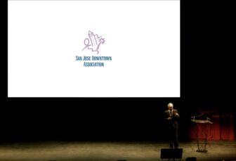
The minimalist purple, magenta and orange motif replaces the one developed by graphic designer Don Faia in the late 1980s, which featured the Guadalupe River, a palm tree, a suggestion of a skyline and a person watching the passage of time on the former Pavilion retail center’s clock tower.

Scott Knies stands in front of the San Jose Downtown Association logo that represented the downtown business organization for three decades.
The new identity for the city’s downtown was unveiled at the business association’s Dec. 10 annual meeting at the Hammer Theatre Center by Liquid’s Chief Design Officer, Justin Peters.
Liquid Agency, for many years based in the SoFA District, now has offices in San Jose, Portland, New York and Santiago, Chile.
San Jose Downtown Association Executive Director Scott Knies said the rebranding was an outgrowth of a strategic plan to reinvent the organization to meet the challenges of a rapidly changing downtown.


perfect!
Maybe they can add next to this important development
a ‘minimalist’ symbol of a Tent and RV with a Magenta Circle & Large X over it?
A sardonic “perfect!” is correct. The logo is as uninspiring as the San Jose skyline.
You clowns nailed it!
Keep doing things that are not substantial to real improvements. And SJ wonders why they fail at almost everything they touch.
Wait a minute. Is it April fool’s day? Something tells me that logo won’t be here next year.
Some brand hack on linkedin named James Robinson says this about trend to oversimplify logo(s) [not to be confused with Logos of Greek and biblical fame]:
“The first and older reason, is to do with established best brand practise(sic). Call it a rule of nature that is almost always obeyed; that the brand manager/team, at every step of the development of the visual identity of a brand, will try to reduce the complexity of the message. More detail equates to more information for the consumer to process, but by reducing complexity (although holding on to supposedly ‘core’ elements), you can still communicate to your audience via your logo, and do so in less time. A logo that is quicker to digest is, so the received knowledge goes, better for the brand.
The second and more recent reason, is to do with the proliferation of (largely digital) places a logo has to live and work. In a multi-screen world, logos need to reproduce better across a far wider range of, often smaller, formats. As we pinch-to-zoom our way across our screens, it follows that the modern logo needs to be highly scalable, losing nothing of itself or its ability to communicate in the process. A simple logo is more fitted for this development than a complex one.”
But he is wrong, however, the real reasons are two fold:
(1) Our lizardmen overlords are smoothing our brains on multiple fronts and this is just one more subliminal line of attack and (2) the brand hacks have finally convinced the equity hires that fill the corporate cannisters of MarCom that 5 minute effortings(sic) of this ilk are subtle and nuanced examples of marketing genius and diversity, inclusion, and equity.
Downtown San Jose is lame. Liquid Agency is lame. Little wonder that logo is lame.